      <header class="topbar">
          <a id="sidebar-toggle" class="sidebar-toggle" href="javascript:void(0);">
            <i class="fa fa-bars"></i>
          </a>
          <div class="input-wrapper">
            <input type="text"><i class="fa fa-search"></i>
          </div>

          <nav class="right-nav">
            <a href="javascript:void(0);">
                <i class="fa fa-bell"></i>
            </a>
            <a href="javascript:void(0);">
                <i class="fa fa-comment"></i>
            </a>
          </nav>
      </header>
Instead of install the library files locally I prefer to use online CDN. That way it can easily included in project:
https://cdnjs.cloudflare.com/ajax/libs/font-awesome/5.8.1/css/all.css
Showing posts with label html5. Show all posts
Showing posts with label html5. Show all posts
3/31/19
My Own Responsive Admin Template - Part 2
Almost every template/website is using some font icons (because it is easier use font rather than loading images) So In my case I will use font-awesome icons library.
when using this battle tested (and free!) library - you could display icons by using "fa" prefixed classes in your HTML:

3/29/19
My Own Responsive Admin Template - Part 1
Motivation
There are lot of various admin templates out there across the internet like here and there (some even free) and you can find every combination you need instead of creating admin dashboard by yourself.
Yet, since I consider myself an experienced front end programmer - I decided to create responsive admin template of my own, sticking to recent best practices of web development.
Lets see there this little journey will take me and what discoveries I will make
Skeleton
So here I'm starting by create the first skeleton of dashboard using the basic HTML5 tags: aside, nav, main, section
  <div class="wrapper">
      <aside><!--for side nav-->
      </aside>
      <header class="topbar"><!--for topbar-->
         <nav> </nav>
      </header>
      <main>
      </main>
  </div>
Basic css
First thing here - I will declare css variables for each section:
:root {
    --topbar-bg-color: #2A62FF;
    --main-bg-color: #EDF5F8;
    --sidebar-bg-color: #FFF;
    --card-bg-color: #FFF;
    --text-color: #2F2F2F;
}

body {
    background: var(--main-bg-color);
    color: var(--text-color);
}

/*  topbar  */
.topbar {
    background: var(--topbar-bg-color);
}
/*  aside  */
aside {
  width: 240px;
  background: var(--sidebar-bg-color);
}
/*  main  */
main {
    background: var(--main-bg-color);
}
/*  card  */
.card {
    background: var(--card-bg-color);
}
Basic Layout using CSS Grid
Css grid - is a grate CSS3 feature for build various layouts
It gives you the ability to associate html elements with various grid areas
.wrapper {
    display: grid;
    height: 100vh;
    grid-template-areas:
    "aside topbar"
    "aside main";
    grid-template-columns: 240px auto;
    grid-template-rows: 40px auto;
}
.topbar {
    grid-area: topbar;
}
aside {
    grid-area: aside;
}
main {
    grid-area: main;
}
Subscribe to:
Posts (Atom)
Getting started with docker
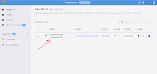
It is very simple to get started usig docker. All you need to do-is download the docker desktop for your system Once you get docker syste...
-
 It is very simple to get started usig docker. All you need to do-is download the docker desktop for your system Once you get docker syste...
 -
In frameworks like angular and react we have this behavior that tracks every change of model (a javascript variable which stores state of so...
-
well - main thing application should do - is to display data. so, you can fetch data from external source very simple: export const getSta...